Welcome to 'The
House Rental Site'
project.
Welcome to 'The
House Rental Site'
project.
Solution
One effective UX solution for improving a house rental website is to enhance the search and filtering functionalities. By providing users with more robust filtering options, such as the ability to refine searches based on location, price range, number of bedrooms, amenities, and availability dates, users can easily narrow down their choices to properties that match their specific criteria. Additionally, implementing advanced sorting options, such as sorting by relevance, price, or rating, allows users to prioritize their search results based on their preferences..
My Design Process


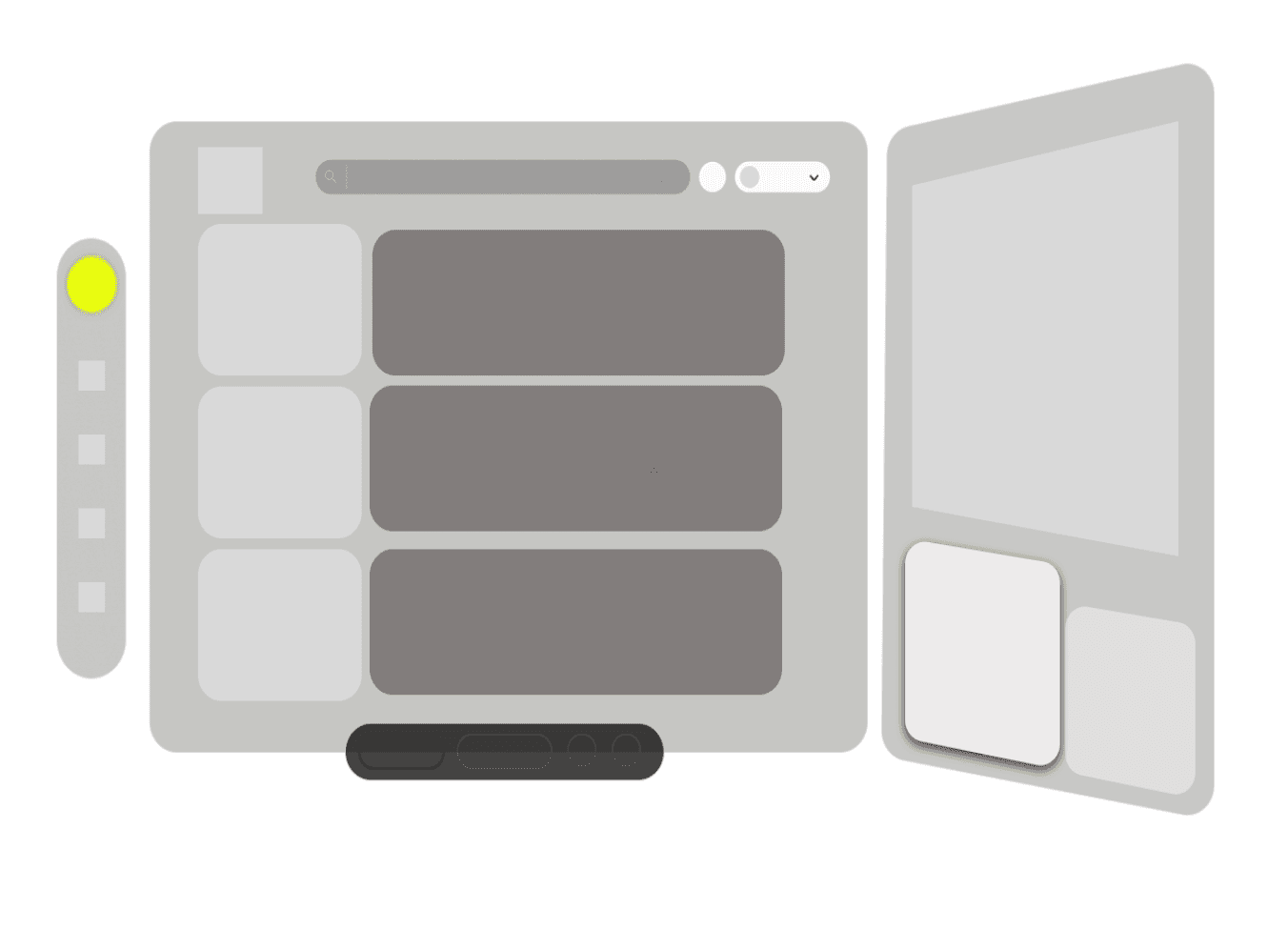
Sketches
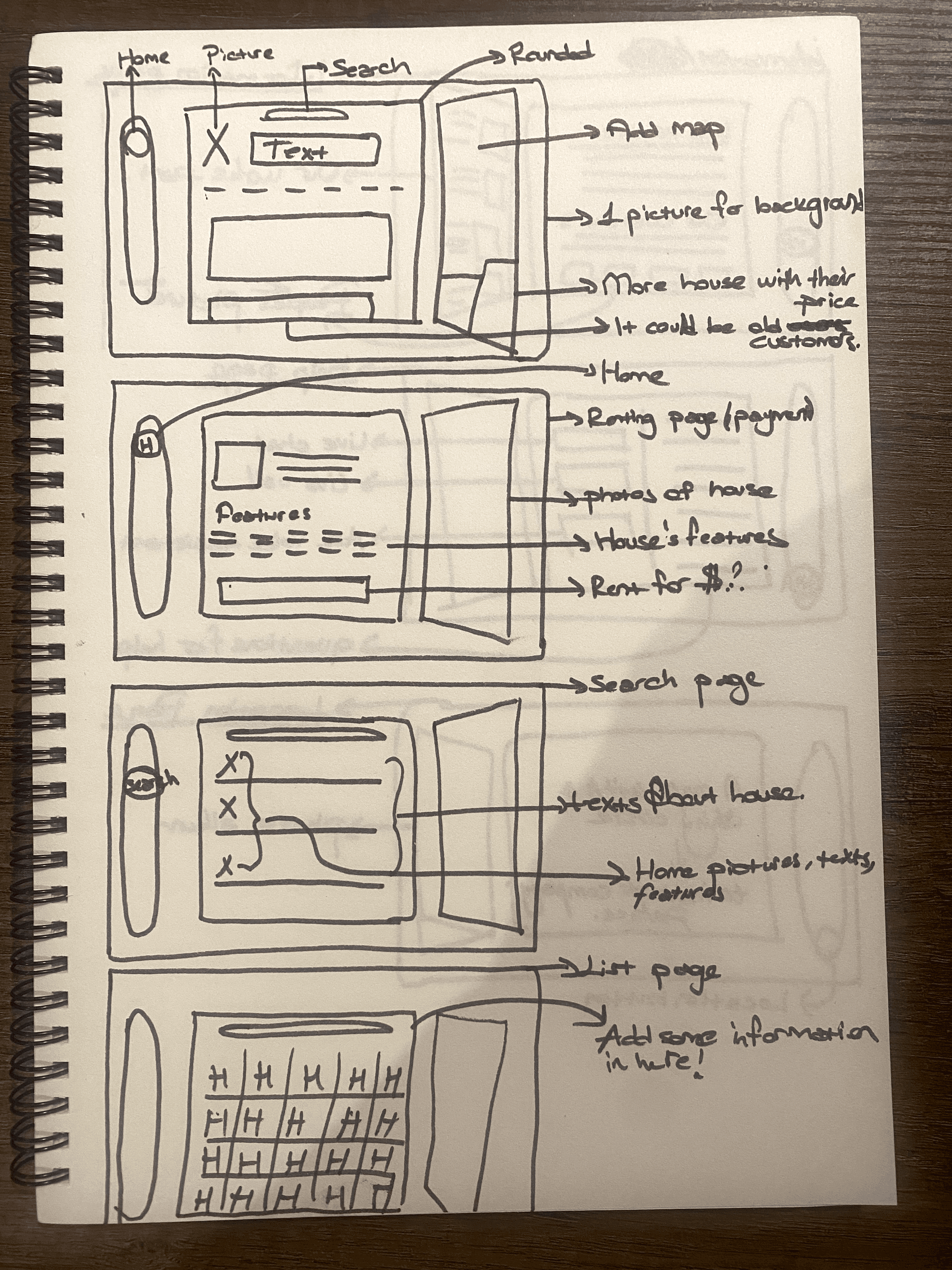
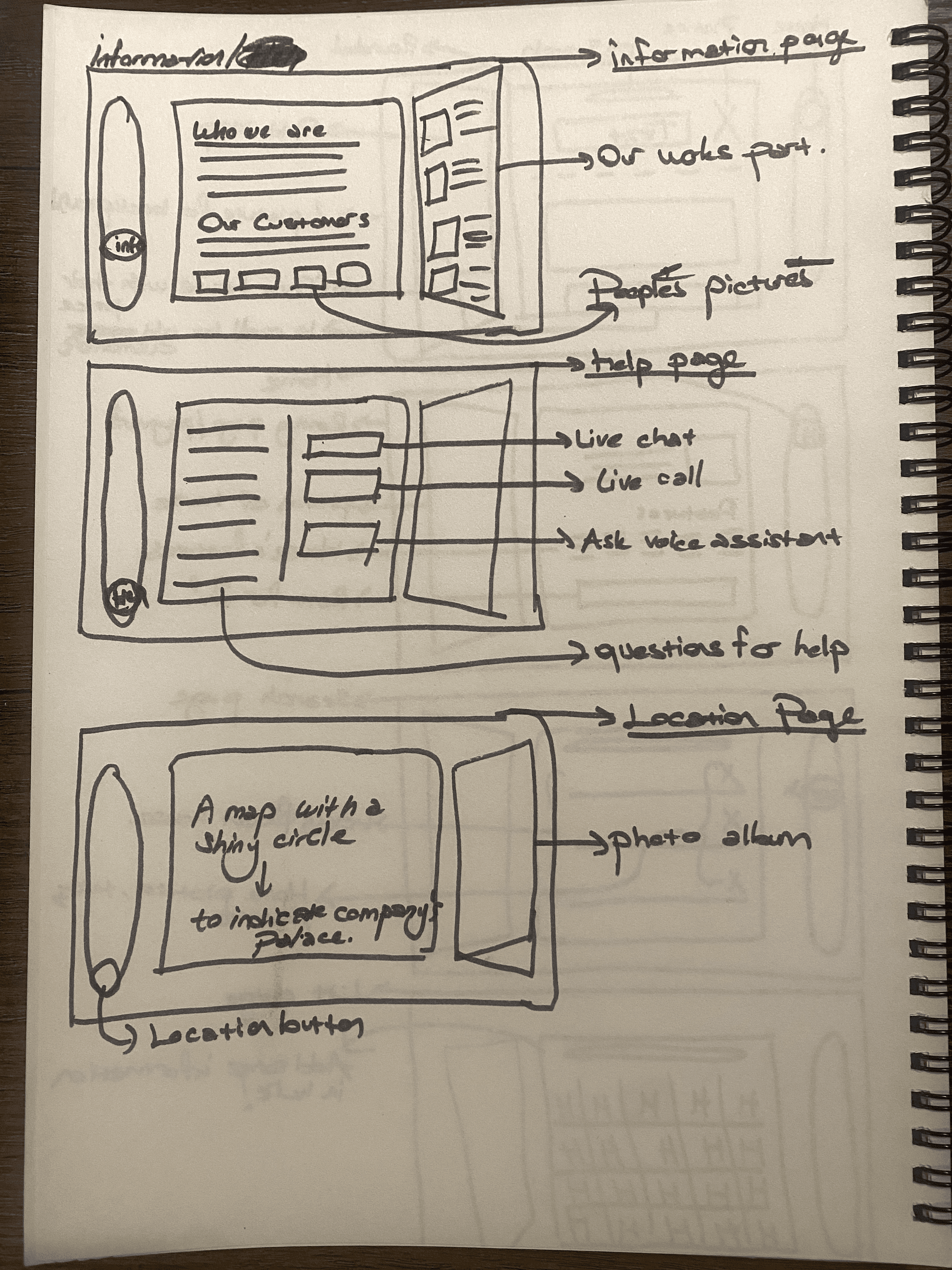
I began the design process with low-fidelity sketches and wireframes to accelerate decision-making through visualization without losing time. My sketches were based on the initial user interviews, the business goal, and the heuristic evaluation. They each pointed to the fact that there were too many distractions in the flow. We came back to the sketches throughout the entire design process to make sure that we don’t lose sight of our primary goals and ideas. Here is my questions when I started the sketching:
What was the main purpose of my sketches?
What information was the basis for my sketches?
If I made multiple versions what were their main differences?
Which version did I choose and why?
Get in touch!
byarentunc@gmail.com
Read more of my case studies

Timeline
Overall: 4 weeks
Discovery & Research: 2+ weeks
Design & testing: 2 weeks
Timeline
Overall: 4 weeks
Discovery & Research: 2+ weeks
Design & testing: 2 weeks
Hİ THERE,
Hİ THERE,
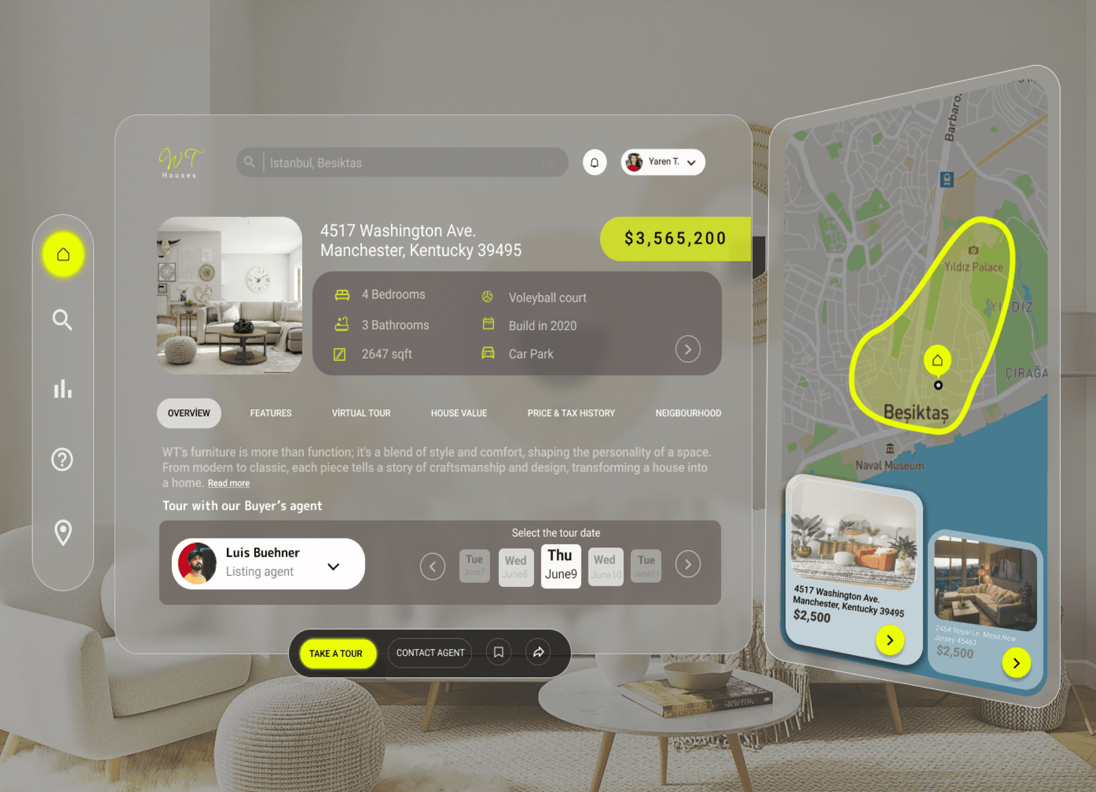
Designing a house rental website with optimal user experience (UX) requires a careful balance of simplicity and
efficiency. The homepage should provide easy access to search functionalities, allowing users to quickly find
properties based on their preferences. Clear and enticing property listings with high-quality images and detailed
descriptions enable users to evaluate options effectively.
Problem
A common UX problem on house rental websites is the overwhelming amount of search results, making it difficult for users to find properties that meet their specific criteria. Users often struggle to narrow down their options due to limited filtering and sorting capabilities, leading to frustration and a sense of being overwhelmed. Additionally, inconsistencies in property listings, such as incomplete information or outdated availability status, further compound this issue.
Solution
One effective UX solution for improving a house rental website is to enhance the search and filtering functionalities. By providing users with more robust filtering options, such as the ability to refine searches based on location, price range, number of bedrooms, amenities, and availability dates, users can easily narrow down their choices to properties that match their specific criteria. Additionally, implementing advanced sorting options, such as sorting by relevance, price, or rating, allows users to prioritize their search results based on their preferences..
My Role
UX design
UX research
My Role
UX design
UX research
Tools
Adobe XD
Figma
Tools
Adobe XD
Figma
Team
1 UX designer
1 project manager
Team
1 UX designer
1 project manager
First step
Surveys
1
Second step
Sketching
2
Third step
Wireframing
3
Fourth step
User
Journey
4
Fifth step
Usability
test
5
Sixth step
Final
6
Surveys
We started the meeting with this speech:
"We greatly value your feedback to help us improve your experience with our skincare application. Your insights are invaluable in shaping future updates and enhancements. Please take a few moments to share your thoughts with us. How satisfied are you with the overall user interface and navigation of the app? Do you find the personalized skincare recommendations helpful in addressing your skin concerns? Are there any features or functionalities you would like to see added or improved upon? Your input is instrumental in ensuring that our skincare application meets your needs and exceeds your expectations. Thank you for your time and participation!"


01
“I'd love to see personalized
steps in an application for
skin care.”
04
“I'm looking for help
customizing my skin
care.”
03
“I want to see Access to
skincare experts,
dermatologists for
personalized consultations,
advice, and answers to
specific skincare questions.”
02
“There should be an application that clearly shows the filter results suitable for my skin
type.”
05
“An application that would teach me my skin type and
recommend care products
suitable for my skin type would be great.”
06
“A library of articles, videos,
tutorials, and FAQs
covering various skincare
topics, from basic skincare
principles to advanced
techniques and trends.”

Value for money.
Discovering new places.
Meeting cultures.
Love comfort zone.
•
•
•
•
Motivations
Age:
Location:
Job:
Education:
35
Brighton
Architecture
Liberal Arts
Basic info
Emma
Social Media
Internet
Referrals
Magazines
Channels
Owerhelming amount search results.
Difficult find properties that meet their spesific criteria.
Often struggle to narrow down their options due to limited filtering and sorting capabilities.
Pain Points
•
•
•
•
•
•
•
Motivations
Winding down.
Monthly retreat.
Rediscovering oneself.
Love comfort zone.
Basic info
MaX
Social Media
Internet
Referrals
Magazines
Channels
Owerhelming amount search results.
Difficult find properties that meet their spesific criteria.
Often struggle to narrow down their options due to limited filtering and sorting capabilities.
Pain Points
•
•
•

Age:
Location:
Job:
Education:
28
Manchester
Life coach
Psychology
User Journey
With the business goal in mind, we make sure that our users reach the checkout screen without any hiccups. So, we sketched a current-state user journey map, to identify opportunities for improvement. We identified 2 unnecessary steps and potential dropoff points in the flow. By eliminating these from the new design, we
ended up with a much faster checkout experience that contributed toconversion rates. Here is our questions :
How and why did you choose which path/s to map?
How did you test and validate the map?
What did the journey mapping reveal?
What were the main pain points of the user?
What changed in the design due to user journey mapping?
To get start internet
research.
Too many options
to choose from.
Personalized
search results.
Find a site or installation
to discover.
Introducing a hidden home page category
that is update
frequently.
AWARE
USER GOALS
PROBLEMS
IDEAS
SEARCH
ON WAY
Overwhelming amount
of search result.
Improve search results.
SHOPPING
The options are too
varied and the
options are not
personalised.
Doesn’t feeling that
the houses is
equipped to meet
the demands.
Find the houses
that is preferable.
Feeling that the
houses is equipped
to meet the
demands.
EMOTIONS
Have an easy way
to access the a
dream houses once
there.
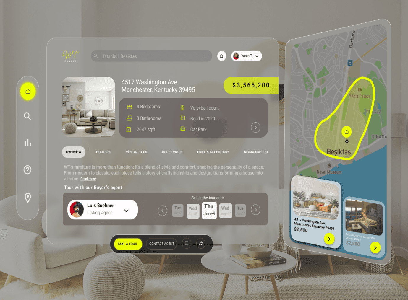
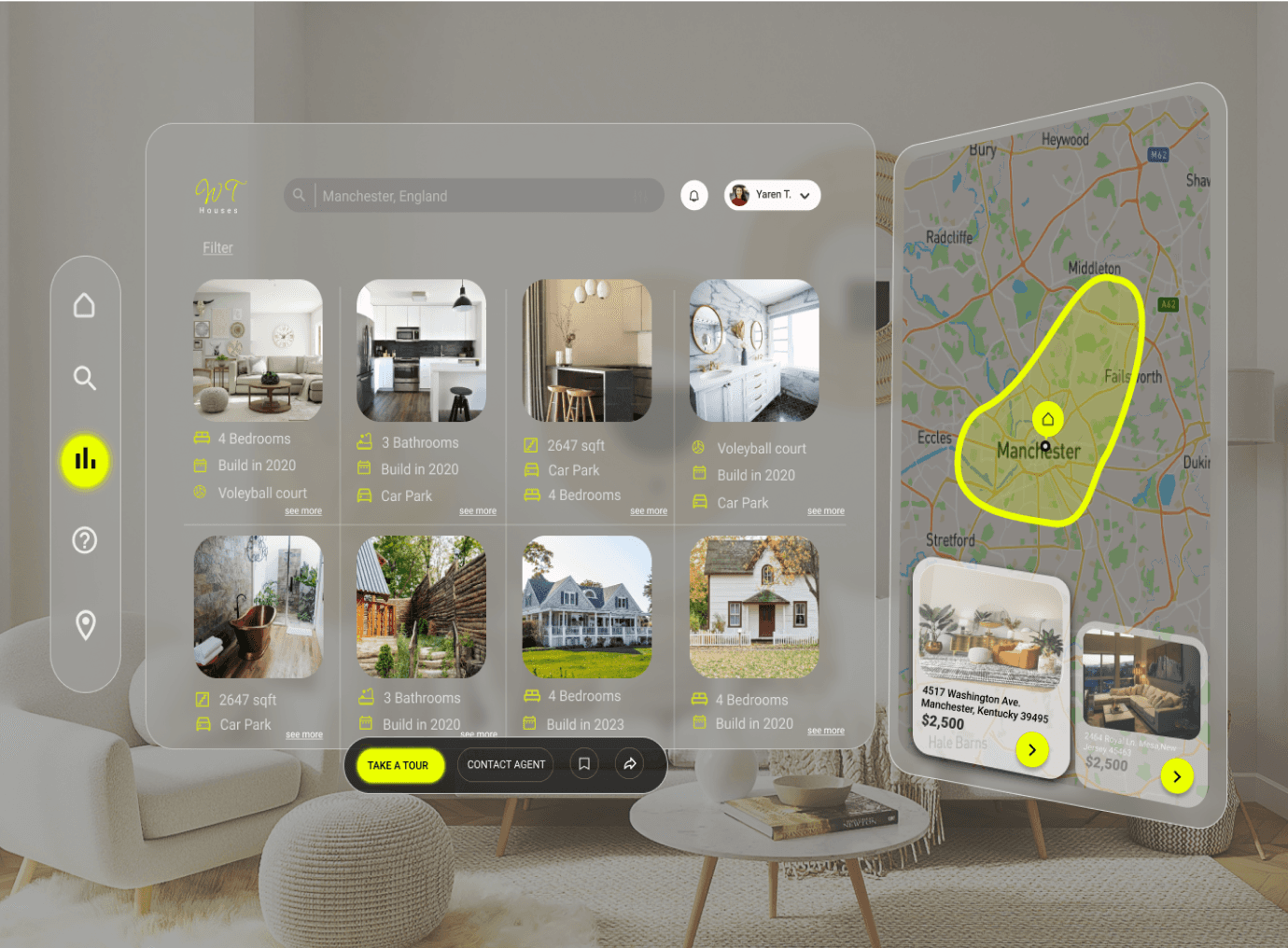
Wireframes
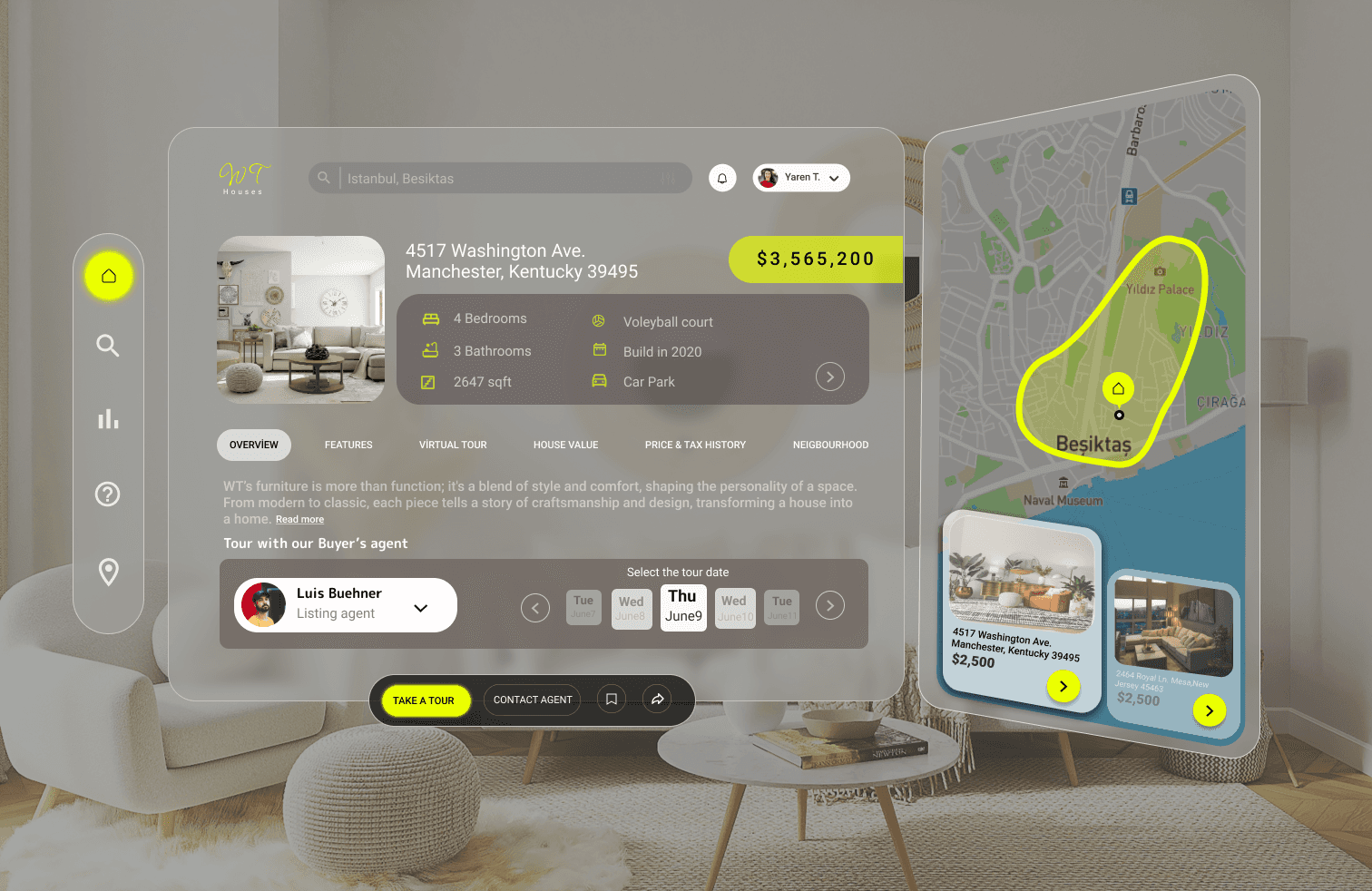
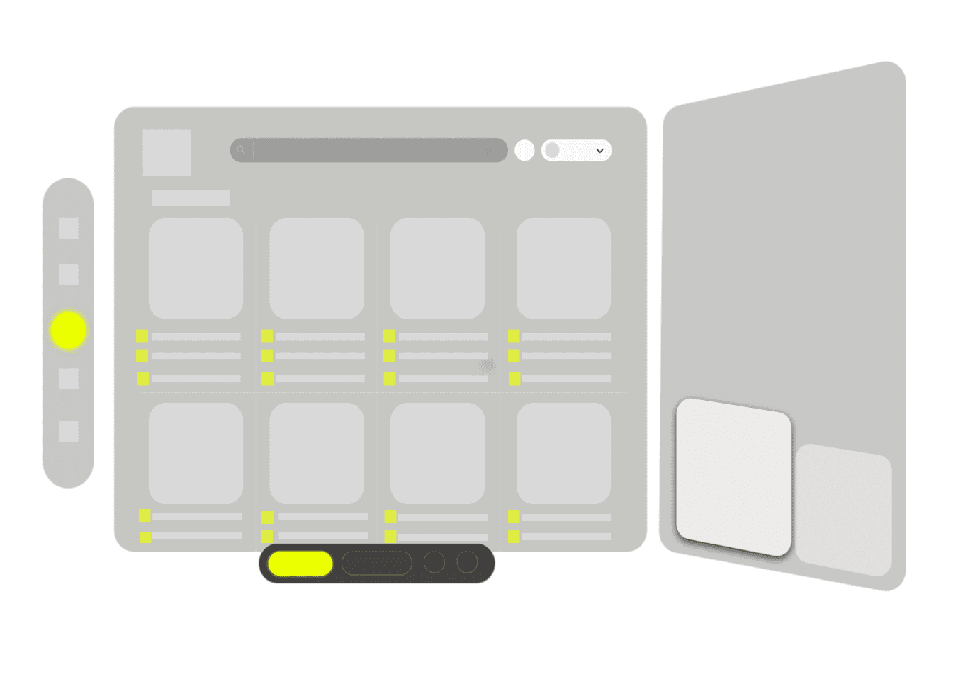
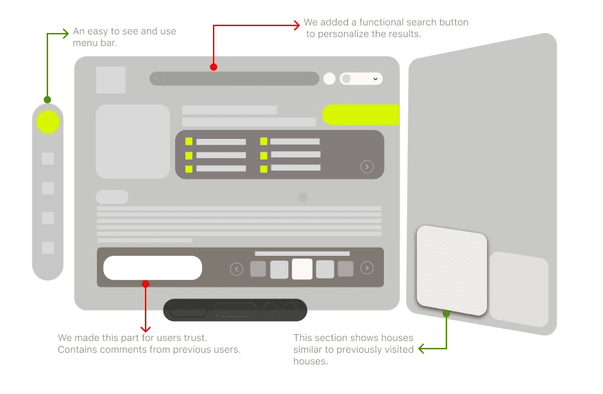
Using Figma, I translated my first sketches into low-fidelity wireframes. Then, I improved them by adding a few relevant stock images and copies provided by the marketing team. At this stage, the wireframes were defined enough for some user testing. Based on 4 tests, I’ve made a few alternations and moved on to creating high-fidelity prototypes.

Thank you for reading my case study!
Want to work with me? Feel free to contact me!
...or just say hello on my social media.
1
To get start internet research.
Too many options to choose from
2
Find a site or
installation to
discover.
The options are too varied and the options are not personalized.
3
Find the houses that is preferable.
Feeling that the houses is equipped to meet the demands.
4
Fast and easy way to examine renting and purschase.
Have an easy way to access the a dream house once there.
Customer Journey
We created a customer journey map to build a better understanding of how customers find and interact with the service and to discover opportunities for improvement. The map revealed many user problems and opportunities at the consideration and loyalty stages of the customer journey. Therefore, we paid special attention to these stages during the
design process. Here is our questions :
What did we want to find out with customer journey mapping?
What stages in the journey did we examine?
What were the main touchpoints at each step?
What did we suggest to resolve these pain points?
What new features or design changes came from mapping the customer journey?
UI Design-Final
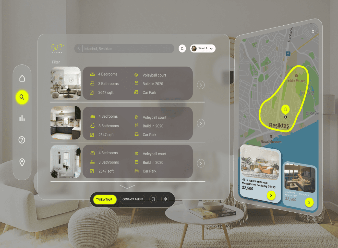
Once the usability issues were resolved, I moved on to design the final screens in Figma. My goal was to create a visual identity that’s aligned with the brand’s values and message, which is: “brand motto”. Also, I’ve checked the competition and took a deep dive into my catalog of references for inspiration.


Usability Testing
I created a fully-functional, high-fidelity prototype of the new flows using Axure. At the same time, we started recruiting subjects for the test who fit our criteria. We did 4 usability tests in the first round and 3 after iterating on the issues that we’ve identified:
issue 01
Users may hesitate to engage in direct communication with landlords or property managers if they are uncertain about how their personal data will be handled. Additionally, without proper safeguards in place, there is a risk of misuse of messaging features for unsolicited marketing or spamming purposes. Furthermore, ensuring the security of sensitive information exchanged during communication, such as contact details or financial information, is paramount to prevent data breaches or identity theft. Addressing these privacy and security concerns is crucial to fostering trust and encouraging active engagement in the communication process on the rental platform.
solution 01
An effective solution for a house rental website is to implement a streamlined and transparent communication system between landlords and tenants. This can involve integrating features such as instant messaging or chat support, allowing users to communicate directly with property owners or managers in real-time. Additionally, providing clear guidelines for communication expectations and response times can help manage user expectations and reduce frustration. Moreover, incorporating automated notifications for important updates, such as application status changes or viewing appointments, keeps users informed and engaged throughout the rental process. By facilitating seamless communication between all parties involved, the website can enhance user satisfaction, trust, and overall experience, leading to higher retention rates and positive word-of-mouth referrals.
Timeline
Overall: 4 weeks
Discovery & Research: 2+ weeks
Design & testing: 2 weeks
Timeline
Overall: 4 weeks
Discovery & Research: 2+ weeks
Design & testing: 2 weeks
Welcome to 'The
House Rental Site'
project.
Welcome to 'The
House Rental Site'
project.
Hİ THERE,
Hİ THERE,
Problem
A common UX problem on house rental websites is the overwhelming amount of search results, making it difficult for users to find properties that meet their specific criteria. Users often struggle to narrow down their options due to limited filtering and sorting capabilities, leading to frustration and a sense of being overwhelmed. Additionally, inconsistencies in property listings, such as incomplete information or outdated availability status, further compound this issue.
Solution
One effective UX solution for improving a house rental website is to enhance the search and filtering functionalities. By providing users with more robust filtering options, such as the ability to refine searches based on location, price range, number of bedrooms, amenities, and availability dates, users can easily narrow down their choices to properties that match their specific criteria. Additionally, implementing advanced sorting options, such as sorting by relevance, price, or rating, allows users to prioritize their search results based on their preferences..
Tools
Adobe XD
Figma
Tools
Adobe XD
Figma
Team
1 UX designer
1 project manager
Team
1 UX designer
1 project manager
My Role
UX design
UX research
My Role
UX design
UX research
My Design Process
Surveys
We started the meeting with this speech:
"We greatly value your feedback to help us improve your experience with our skincare application. Your insights are invaluable in shaping future updates and enhancements. Please take a few moments to share your thoughts with us. How satisfied are you with the overall user interface and navigation of the app? Do you find the personalized skincare recommendations helpful in addressing your skin concerns? Are there any features or functionalities you would like to see added or improved upon? Your input is instrumental in ensuring that our skincare application meets your needs and exceeds your expectations. Thank you for your time and participation!"

Designing a house rental website with optimal user experience (UX) requires a careful balance of simplicity and
efficiency. The homepage should provide easy access to search functionalities, allowing users to quickly find
properties based on their preferences. Clear and enticing property listings with high-quality images and detailed
descriptions enable users to evaluate options effectively.


Customer Journey
We created a customer journey map to build a better understanding of how customers find and interact with the service and to discover opportunities for improvement. The map revealed many user problems and opportunities at the consideration and loyalty stages of the customer journey. Therefore, we paid special attention to these stages during the design process. Here is our questions :
What did we want to find out with customer journey mapping?
What stages in the journey did we examine?
What were the main touchpoints at each step?
What did we suggest to resolve these pain points?
What new features or design changes came from mapping the customer journey?
Sketches
I began the design process with low-fidelity sketches and wireframes to accelerate decision-making through visualization without losing time. My sketches were based on the initial user interviews, the business goal, and the heuristic evaluation. They each pointed to the fact that there were too many distractions in the flow. We came back to the sketches throughout the entire design process to make sure that we don’t lose sight of our primary goals and ideas. Here is my questions when I started the sketching:
What was the main purpose of my sketches?
What information was the basis for my sketches?
If I made multiple versions what were their main differences?
Which version did I choose and why?
Wireframes
Using Figma, I translated my first sketches into low-fidelity wireframes. Then, I improved them by adding a few relevant stock images and copies provided by the marketing team. At this stage, the wireframes were defined enough for some user testing. Based on 4 tests, I’ve made a few alternations and moved on to creating high-fidelity prototypes.


UI Design-Final
Once the usability issues were resolved, I moved on to design the final screens in Figma. My goal was to create a visual identity that’s aligned with the brand’s values and message, which is: “brand motto”. Also, I’ve checked the competition and took a deep dive into my catalog of references for inspiration.
Read more of my case studies
Get in touch!
byarentunc@gmail.com


Timeline
Overall: 4 weeks
Discovery & Research: 2+ weeks
Design & testing: 2 weeks
Timeline
Overall: 4 weeks
Discovery & Research: 2+ weeks
Design & testing: 2 weeks
First step
Surveys
1
Second step
Sketching
2
Third step
Wireframing
3
Fourth step
User
Journey
4
Fifth step
Usability
test
5
Sixth step
Final
6
User Journey
With the business goal in mind, we make sure that our users reach the checkout screen without any hiccups.So, we sketched a current-state user journey map, to identify opportunities for improvement. We identified 2
unnecessary steps and potential dropoff points in the flow. By eliminating these from the new design, we ended up with a much faster checkout experience that contributed to conversion rates. Here is our questions :
How and why did you choose which path/s to map?
How did you test and validate the map?
What did the journey mapping reveal?
What were the main pain points of the user?
What changed in the design due to user journey mapping?


Age:
Location:
Job:
Education:
35
Brighton
Architecture
Liberal Arts
Basic info
Value for money.
Discovering new places.
Meeting cultures.
Love comfort zone.
•
•
•
•
Owerhelming amount search results.
Difficult find properties that meet their spesific criteria.
Often struggle to narrow down their options due to
limited filtering and sorting capabilities.
•
•
•
Social Media
Internet
Referrals
Magazines
Channels
Emma
Motivations
Pain Points
Age:
Location:
Job:
Education:
28
Manchester
Life coach
Psychology
•
•
•
•
Winding down.
Monthly retreat.
Rediscovering oneself.
Love comfort zone.
Motivations
Owerhelming amount search results.
Difficult find properties that meet their spesific criteria.
Often struggle to narrow down their options due to
limited filtering and sorting capabilities.
•
•
•
MAx
Social Media
Internet
Referrals
Magazines
Basic info
Channels
Pain Points
1
To get start internet research.
Too many options to choose from
2
Find a site or
installation to
discover.
The options are too varied and the options are not personalized.
3
Find the houses that is preferable.
Feeling that the houses is equipped to meet the demands.
4
Fast and easy way to examine renting and purschase.
Have an easy way to access the a dream house once there.
To get start internet
research.
Too many options
to choose from.
Personalized
search results.
Overwhelming amount
of search result.
AWARE
USER GOALS
PROBLEMS
IDEAS
SEARCH
ON WAY
Find a site or installation
to discover.
Have an easy way
to access the a
dream houses once
there.
Introducing a hidden
home page category
that is update
frequently.
Improve search results.
SHOPPING
The options are too
varied and the
options are not
personalised.
Doesn’t feeling that
the houses is
equipped to meet
the demands.
EMOTIONS
Find the houses
that is preferable.
Feeling that the
houses is equipped
to meet the
demands.


Usability Testing
I created a fully-functional, high-fidelity prototype of the new flows using Axure. At the same time, we started recruiting subjects for the test who fit our criteria. We did 4 usability tests in the first round and 3 after iterating on the issues that we’ve identified:
issue 01
Users may hesitate to engage in direct communication with landlords or property managers if they are uncertain about how their personal data will be handled. Additionally, without proper safeguards in place, there is a risk of misuse of messaging features for unsolicited marketing or spamming purposes. Furthermore, ensuring the security of sensitive information exchanged during communication, such as contact details or financial information, is paramount to prevent data breaches or identity theft. Addressing these privacy and security concerns is crucial to fostering trust and encouraging active engagement in the communication process on the rental platform.
solution 01
An effective solution for a house rental website is to implement a streamlined and transparent communication system between landlords and tenants. This can involve integrating features such as instant messaging or chat support, allowing users to communicate directly with property owners or managers in real-time. Additionally, providing clear guidelines for communication expectations and response times can help manage user expectations and reduce frustration. Moreover, incorporating automated notifications for important updates, such as application status changes or viewing appointments, keeps users informed and engaged throughout the rental process. By facilitating seamless communication between all parties involved, the website can enhance user satisfaction, trust, and overall experience, leading to higher retention rates and positive word-of-mouth referrals.


Thank you for reading my case study!
Want to work with me? Feel free to contact me!
...or just say hello on my social media.
01
“I'd love to see personalized steps in an application for
skin care.”
05
“An application that would teach
me my skin type and recommend care products suitable for my skin type would be great.”
02
06
“A library of articles, videos,
tutorials, and FAQs covering various skincare topics, from basic skincare principles to advanced techniques and trends.”
04
“I'm looking for help customizing my skin
care.”
03
“I want to see Access to
skincare experts, dermatologists for personalized consultations,
advice, and answers to
specific skincare questions.”
“There should be an
application that clearly
shows the filter results
suitable for my skin
type.”
Welcome to 'The
House Rental Site'
project.
Hİ THERE,
Problem
A common UX problem on house rental websites is the overwhelming amount of search results, making it difficult for users to find properties that meet their specific criteria. Users often struggle to narrow down their options due to limited filtering and sorting capabilities, leading to frustration and a sense of being overwhelmed. Additionally, inconsistencies in property listings, such as incomplete information or outdated availability status, further compound this issue.
Solution
One effective UX solution for improving a house rental website is to enhance the search and filtering functionalities. By providing users with more robust filtering options, such as the ability to refine searches based on location, price range, number of bedrooms, amenities, and availability dates, users can easily narrow down their choices to properties that match their specific criteria. Additionally, implementing advanced sorting options, such as sorting by relevance, price, or rating, allows users to prioritize their search results based on their preferences..
Tools
Adobe XD
Figma
Team
1 UX designer
1 project manager
My Role
UX design
UX research
My Design Process
Surveys
We started the meeting with this speech:
"We greatly value your feedback to help us improve your experience with our skincare application. Your insights are invaluable in shaping future updates and enhancements. Please take a few moments to share your thoughts with us. How satisfied are you with the overall user interface and navigation of the app? Do you find the personalized skincare recommendations helpful in addressing your skin concerns? Are there any features or functionalities you would like to see added or improved upon? Your input is instrumental in ensuring that our skincare application meets your needs and exceeds your expectations. Thank you for your time and participation!"

Designing a house rental website with optimal user experience (UX) requires a careful balance of simplicity and
efficiency. The homepage should provide easy access to search functionalities, allowing users to quickly find
properties based on their preferences. Clear and enticing property listings with high-quality images and detailed
descriptions enable users to evaluate options effectively.


06
02
“There should be an application that clearly shows the filter results suitable for my skin
type.”

Age:
Location:
Job:
Education:
35
Brighton
Architecture
Liberal Arts
Basic info
Value for money.
Discovering new places.
Meeting cultures.
Love comfort zone.
•
•
•
•
Motivations
Owerhelming amount search results.
Difficult find properties that meet their spesific criteria.
Often struggle to narrow down their options due to
limited filtering and sorting capabilities.
•
•
•
Pain Points
Social Media
Internet
Referrals
Magazines
Channels
Emma

Customer Journey
We created a customer journey map to build a better understanding of how customers find and interact with the service
and to discover opportunities for improvement. The map revealed many user problems and opportunities at the
consideration and loyalty stages of the customer journey. Therefore, we paid special attention to these stages during the
design process. Here is our questions :
What did we want to find out with customer journey mapping?
What stages in the journey did we examine?
What were the main touchpoints at each step?
What did we suggest to resolve these pain points?
What new features or design changes came from mapping the customer journey?
Sketches
I began the design process with low-fidelity sketches and wireframes to accelerate decision-making through visualization without losing time. My sketches were based on the initial user interviews, the business goal, and the heuristic evaluation. They each pointed to the fact that there were too many distractions in the flow. We came back to the sketches throughout the entire design process to make sure that we don’t lose sight of our primary goals and ideas. Here is my questions when I started the sketching:
What was the main purpose of my sketches?
What information was the basis for my sketches?
If I made multiple versions what were their main differences?
Which version did I choose and why?


Wireframes
Using Figma, I translated my first sketches into low-fidelity wireframes. Then, I improved them by adding a few relevant stock images and copies provided by the marketing team. At this stage, the wireframes were defined enough for some user testing. Based on 4 tests, I’ve made a few alternations and moved on to creating high-fidelity prototypes.

Usability Testing
I created a fully-functional, high-fidelity prototype of the new flows using Axure. At the same time, we started recruiting subjects for the test who fit our criteria. We did 4 usability tests in the first round and 3 after iterating on the issues that we’ve identified:
issue 01
Users may hesitate to engage in direct communication with landlords or property managers if they are uncertain about how their personal data will be handled. Additionally, without proper safeguards in place, there is a risk of misuse of messaging features for unsolicited marketing or spamming purposes. Furthermore, ensuring the security of sensitive information exchanged during communication, such as contact details or financial information, is paramount to prevent data breaches or identity theft. Addressing these privacy and security concerns is crucial to fostering trust and encouraging active engagement in the communication process on the rental platform.
solution 01
An effective solution for a house rental website is to implement a streamlined and transparent communication system between landlords and tenants. This can involve integrating features such as instant messaging or chat support, allowing users to communicate directly with property owners or managers in real-time. Additionally, providing clear guidelines for communication expectations and response times can help manage user expectations and reduce frustration. Moreover, incorporating automated notifications for important updates, such as application status changes or viewing appointments, keeps users informed and engaged throughout the rental process. By facilitating seamless communication between all parties involved, the website can enhance user satisfaction, trust, and overall experience, leading to higher retention rates and positive word-of-mouth referrals.

UI Design-Final
Once the usability issues were resolved, I moved on to design the final screens in Figma. My goal was to create a visual identity that’s aligned with the brand’s values and message, which is: “brand motto”. Also, I’ve checked the competition and took a deep dive into my catalog of references for inspiration.


Read more of my case studies
Get in touch!
byarentunc@gmail.com
Read more of my case studies
Thank you for reading my case study!
Want to work with me? Feel free to contact me!
...or just say hello on my social media.


“A library of articles, videos,
tutorials, and FAQs
covering various skincare
topics, from basic skincare
principles to advanced
techniques and trends.”
01
04
05
03
“I'd love to see personalized
steps in an application for
skin care.”
“I want to see Access to
skincare experts,
dermatologists for
personalized consultations,
advice, and answers to
specific skincare questions.”
“I'm looking for help
customizing my skin
care.”
“An application that would teach
me my skin type and
recommend care products
suitable for my skin type would
be great.”
1
To get start internet research.
Too many options to choose from
2
Find a site or
installation to
discover.
The options are too varied and the options are not personalized.
3
Find the houses that is preferable.
Feeling that the houses is equipped to meet the demands.
4
Fast and easy way to examine renting and purschase.
Have an easy way to access the a dream house once there.
AWARE
USER GOALS
PROBLEMS
IDEAS
SEARCH
ON WAY
To get start internet
research.
Find a site or installation
to discover.
Have an easy way
to access the a
dream houses once
there.
Too many options
to choose from.
Personalized
search results.
Introducing a hidden
home page category
that is update
frequently.
Overwhelming amount
of search result.
Improve search results.
SHOPPING
The options are too
varied and the
options are not
personalised.
Feeling that the
houses is equipped
to meet the
demands.
Doesn’t feeling that
the houses is
equipped to meet
the demands.
EMOTIONS
Find the houses
that is preferable.
Timeline
Overall: 4 weeks
Discovery & Research: 2+ weeks
Design & testing: 2 weeks
First step
Surveys
1
Second step
Sketching
2
Third step
Wireframing
3
Fourth step
User
Journey
4
Fifth step
Usability
test
5
Sixth step
Final
6
User Journey
With the business goal in mind, we make sure that our users reach the checkout screen without any hiccups.
So, we sketched a current-state user journey map, to identify opportunities for improvement. We identified 2
unnecessary steps and potential dropoff points in the flow. By eliminating these from the new design, we
ended up with a much faster checkout experience that contributed to conversion rates. Here is our questions :
How and why did you choose which path/s to map?
How did you test and validate the map?
What did the journey mapping reveal?
What were the main pain points of the user?
What changed in the design due to user journey mapping?
Age:
Location:
Job:
Education:
Basic info
•
•
•
•
Motivations
Owerhelming amount search results.
Difficult find properties that meet their spesific criteria.
Often struggle to narrow down their options due to
limited filtering and sorting capabilities.
•
•
•
Pain Points
MAx
Winding down.
Monthly retreat.
Rediscovering oneself.
Love comfort zone.
28
Manchester
Life coach
Psychology
Social Media
Internet
Referrals
Magazines
Channels
